Panasonic SimpliFi
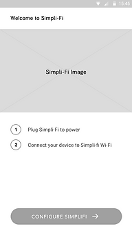
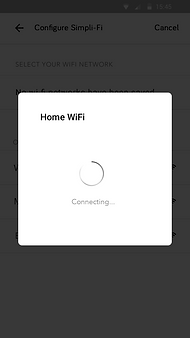
Panasonic Simpli-Fi is a smart home voice assistant through which a user can control thousands of compatible appliances, lights, cameras, while simultaneously getting notified on the application.
Impact: Approximately 10% increase in the user base.
Role
Lead Designer & Product Strategist
Timeline
2017-2018
Status
Contributions
Discover, Define, Design & Access
Live

Problem Statement
Escrowed mortgage customers can only receive their escrow overage refund as a mailed check. The refund check is sent within the escrow statement envelope often resulting in customers missing it and/or requiring U.S. Bank to have to reissue the check.
Potential Solution
Provide a digital and efficient way to customers their refunds in lieu of paper checks.
Target Audience
Mortgage customers with a escrow overage refund.
Desired Outcomes
-
Cost Savings: Reduction in printed escrow overage checks and expenses, escrow-related inbound calls, reduction in escrow overage replacement checks, manual processing.
-
Digital Engagement: Increases DIY features for customers. Provide digital options to receive escrow refund (currently only available via mailed check).
-
Speed of service: customers will receive their escrow overage refund faster. Upto 3 business days for ACH deposit vs. 30 calendar days for mailed check.
-
Reusable design: Created a mostly reusable framework for digitizing other refund check processes (paid in full, loss draft, etc.).
UX Scenarios
-
The primary intent is to have the house's appliances seamlessly monitored and controlled through the mobile device.
-
Another salient feature is to track the vehicle's health including tyre pressure, gas status, and mileage intelligently through the device, so the users can proactively keep a check on their vehicles.
-
Empowering home security feature which will send alerts to users on their mobile devices.
-
Enabling geofence feature which can send safe driving alerts to mobile devices.
My Responsibilites
While working with Harman Connected Services, I got a chance to work on multifarious projects, out of which Panasonic Simpli-Fi was one of the very interesting ones. I was involved in the project from the scratch, including the sales pitch to the Panasonic stakeholders. Describing my role, I created all the scenarios, encompassing all the different use cases of an IoT product. I single-handedly created all the wireframes and mockups in an agile process. Further, I carried out UX research, which comprehensively covered multiple use cases, personas, surveys, questionnaires.
I also carried out prototyping and UI/UX design. Apart from that, I had a solid interaction with the developers through the course of the projects that give me a lucid idea of the entire design cycle. Additionally, I presented the work to the Panasonic team on site, while collecting and implementing their feedback on a regular basis.
Discover Phase
-
Engaged in regular discussions with the quad squad to clarify requirements, scope, and dependencies on other teams.
-
Planned sprints ahead of time to ensure smooth progress and meet deadlines.
-
Analyzed similar experiences both within and outside the bank to gather insights on how other products perform.
-
Sketched initial designs, worked on journey mapping, and presented to stakeholders for alignment on requirements.
-
Developed personas to guide design decisions.
-
Worked on user journey diagram.

Lisa comes home back and SimpliFi
welcomes her.

Lisa can control all the appliances at home which SimpliFi app.

It is easy to use and can be used by other family members too.

Her husband can turn on or off all the appliances through the application.

She was in bedroom and realised that television is on in living room so she asked SimpliFi to turn it off.

SimpliFi will notify if there is any service maintenance is due.

She is tracking her daughter's vehicle and receiving alerts if there is any emergency.

She went out with family and realised that she left her main door opened so she open her app to close the door.

When she is away from her home, then the home is locked and secured by the cameras. She will receive alert if there is any detection.
Define Phase
Explorations: The project involved thorough web-based research and I jotted down the different aspects on which I want the application to be focussed. Based on my exploration, I felt that the application should be vibrant, illustrative and bright so the user can spend more time on a screen. At the same time, it had to be personalized so the user feels at home, controlling all his devices.
Competitive Analysis: The competitive analysis of existing smart home products was done for an understanding similar experiences.
Information Architecture: I divided the user needs into chunks and prioritized them. I delineated different flows and created their information architecture, such as user registration & setup flow, and add devices flow.
Wireframing: After finalizing information architecture, I created low-fidelity wireframes which was comprehensively discussed internally among the design team and the developers. Based on their feedback, I put together high fidelity wireframes which laid the foundation principles of the final UI design.
Company
Show
Statistics
Estimated
Bill
Purchase
Appliances
Watch
Videos
Graphical UI
Automation
Trouble
Shooter
Bill
Payment
Hometech
Alexa
Smart Life
Smart Home
Syska
Wipro
Google Home


Design Phase
-
We make the task simple using the app. All you need to do is register your device, add spaces, set routines which is done in a seamless manner. Hence Affordance is assured.
-
The Aesthetic-Usability of the app entices the user and grants them a joy to handle it higher and often.
-
The icons are positioned based on Fitts’s law. With each prospect categorized in segments. This makes the user feel light.
-
Color pierces the pit of the heart. I have preferred a white framework and a few colors and images to give it a feel like home.
-
Since there are multiple actions that can be performed via the app, I planned to divide each into sections, Chunking the alike groups together, which makes the process easy.
-
Legibility- The details selected already and that to be selected are given clearly on each screen. Hence the summary of the process is in one clear view.
-
Once you click the desired choice, it is possible to change it as simple as before. Forgiveness is proffered. The user can also go back to the screens and reelect. The back button appears at the top of the screen which makes users less click and stays for longer on the current screen. This was done so that users can adopt the app easily as I have reduced the Performance Load.
-
Satisficing: All the options selected by the user are given on a single screen, which is a landing screen where the user can track all activities. They can view spaces, upcoming routines, play media and check security-related content.
.jpg)

.jpg)
Assess Phase
Goals:
-
To see if customers click on the tooltip next to “Choose or add an account”.
-
To see if customers understand that the account will not be saved and its for one time use only.
Qualitative Research
-
Developed a test plan (questionnaire) in an unmoderated mode, desktop version.
-
Questionnaire (e.g. Likert scales, rating scales, and both open and close-ended).
-
Conducted with 50 participants (to see how seamless or confusing is the experience.)
Quantitative Research
I learned that:
Task 1: Choose or add an account.
-
48 out of 50 participants found the designs were easy to use and self explanatory.
-
Many clicked on the drop-down menu first, but the recordings indicate that this was a lack of reading the instructions rather than a misunderstanding of how to add an account.
-
None of the participants clicked on the tooltip next to “Choose or add an account”.
Task 2: Add an account to deposit your refund into.
-
Participants did not face any confusion on the “Add new account” page.
-
All of the participants seemed to read the disclaimer that their new account would not be saved. The disclaimer therefore didn’t cause any confusion or roadblocks for participants completing this flow.
Recommendations:
Since no participants clicked the tooltip, the recommendation is to either:
-
Keep both tooltip and disclaimer, or
-
Remove the tooltip and keep the disclaimer within the “Add a new account” page.
Key Results
Expectations: Met the goals
-
Reduction in escrow replacement check inquiry calls by 50%.
-
Reduction in re-issued refund checks by 50%.
-
Reduction in mortgage servicing incoming calls by 5+%.
-
Overall cost savings of $425k per year from operational efficiency improvements (print/mail savings, reduced calls volume and reduced cost to serve).
Key takeaways
-
Customers prefer to see less or pertinent information on the screen at a time.
-
Multiple action buttons on one screen can be misleading for customers.
-
The OTP authentication process for multiple RCDs (registered current devices) can be somewhat challenging for first-time customers.